Wednesday, December 4, 2024

Dutch publication about the early comic strip in Flemish weeklies (1868-1900)

The Dutch magazine Stripgids has published my overview of early comic strips in the first Flemish illustrated weeklies (1868-1900).

Since some illustrations were quite small printed, here a sample of them:

 
Anon. (1878, September 14). De grootte Hitte Van St-Louis [Heat wave in St. Louis], De Belgische Illustratie 10(51), 405. Previously published in Frank Leslie's Illustrations Newspaper, 1,192 (1878, August 3).
 
Anon. (1874-75). Gezichten van België [Views of Belgium]. De Belgische Illustratie 2(43), 341. Typical decorative page composition for such a series of city views.
 
Anon. (1891, October 11). De tramway in de lucht of het nieuw Lieken van den Tramlala [The tramway in the air or the new Song of the Tramlala].in De Vlaamsche Patriot 4(15), 176. Satirical comic about Brussels politics. The mayor (Buls) is even impaled.

George Herbert Jalland (1892) Mr. Joskins…” in De Vlaamsche Patriot 4(38), p. 452. Republication and translation from an English illustrated journal. The contrast between the text and the images makes it ironical. Thanks to Thierry Smolderen for the identification of the artist, the Flemish publication didn't offer a name.


Monday, October 21, 2024

The same catastrophy in three different journalistic graphic sequences

On September 6, 1889, at around 14:00, there was an explosion in the gunpowder and cartridge factory of Corvilain in Antwerp. The factory was located in the polders near Oosterweel. In the area around the docks and along the shipyard, houses were badly damaged. But there was also a lot of devastation in the rest of the city. The hospitals were flooded with wounded people. With 95 deaths, this was the biggest disaster ever to hit Antwerp in peacetime.
In our sample there are three journalistic graphic sequences about this catastrophe, published a week after the explosion.


De Vlaming,  anon.,‘Schrikkelijke ramp te Antwerpen’ 
Le Patriote illustré, Henri Cassiers?, ‘Catastrophe d’Anvers'
Illustration européenne, M.E. Drot, ‘La catastrophe d’Anvers'

Long shots are common in all three examples, because these viewpoints are ideal to present a context. Only once a close-up is used: De Vlaming ends by a focus on some exploded bullets (there's a Spanish text on the box: "para fusil" = for rifle). 

They all add text to explain what's in the pictures: captions right under the panel, or a number to refer to a general caption, below the page.

There's some variety in what they are presenting. All three show the devastation on the location of the catastrophe: in each sequence there is a drawing of the ruined pub, in two sequences the devastated petroleum depots figure. Le Patriote illustré presents only devastated buildings and a graveside, the other two include emergency workers collecting corpses from the rumble. All three journals focus on the immediate aftermath of the catastrophe: in two cases the fire is not yet extinguished, in Illustration européenne no fires or fumes are any more visible. In all three death is present, two times by the collection of the corpses, ones by the depiction of a grave. 

By comparison, also a photo book La catastrophe d'Anvers was published about the consequences of the explosion.


Monday, October 7, 2024

Cries of the Streets

 This plate "Bruxelles cri-de-rue" ('Brussels, cries of the streets') from the Belgian "L'illustration européenne" (1888-89) shows 14 different types of street vendors in Brussels and their accesories (push carts, bags, etc). They are all in silhouette, because not the individual traits are important, just the idea of a certain type of vendor. 

The only link between the 14 drawings is that they belong to a particular category of professions. Nevertheless, this plate is more than a dry enumeration; in various instances humor is seeping from the silhouettes, especially if we consider them in relation to the captions. The texts are both descriptive (stating the profession) and direct speech (the shoutings of the depicted persons). Since the title situates all these vendors in Brussels, the direct speech uses the languages of the concerned persons, which is in most cases a local Flemish dialect. The descriptive text is always in French, because this plate is published in a French language weekly. 

I've tried to translate the captions, but some parts were not clearly legible for me. The direct speech is set in italics, and I have indicated with parts are in French or in Dutch (or at least the local Brussels dialect):


Friday, April 12, 2024

Two different versions of Wagner's Siegfried (1891)

In the late 19th century illustrated weeklies not only entertained their public with short gags, but they delivered also documentary graphic sequences - mostly about important events like disasters or political struggle. Also cultural events could get such a treatment. It is interesting to see how the same event was rendered in quite different ways.
In 1891, Richard Wagner's opera Siegfried was performed for the first time in Brussels (in De Munt/La Monnaie). A cultural event that the illustrated press of that period paid attention to. I compare two different approaches, each of which recreates four scenes from the opera in a different way. 

One version is, according to the caption, by  François Alexandre Alfred Gérardin (1841-1905) after sketches by Drot and was published in 1891 in the French weekly Le Monde Illustré.

The other version is by the Flemish artist Henri Cassiers (1858-1944) and appeared in 1891 in at least two Belgian illustrated weekly magazines (Illustration Européenne and Le Globe Illustré, the illustration used is from the first magazine).

In terms of content, they choose almost the same scenes: Siegfried and Mine in the cave, Siegfried's fight with the dragon, the meeting with Brunnhilde (Cassiers chooses a moment earlier than Drot and Gérardin). One scene of the four chosen scenes is different: Gérardin opts for the scene with Erda, Cassiers for the fight with the Wanderer. Both scenes are from the third act.
Even more important is the arrangement of the scenes (panels) over the page. If we consider the Western reading pattern (from left to right, from top to bottom) there’s a remarkable difference. Drot and Gérardin place the scenes chronologically, according to their order in the opera. Cassiers, on the other hand, disrupts the chronology: it starts at the top left with the Brunnhilde scene from the third act, next the fight with the dragon from the second act, then the fight between Siegfried and the Wanderer from the third act, and ends at the bottom with a scene from the first act (Siegfried arrives in Mine's cave with the bear). We can only speculate as to why the story was rearranged this way. Perhaps Cassiers thought the idea of an underground rock fits better at the bottom of the page, while he places the scene with Brunnhilde on a higher rock (in the open air) at the very top of the page. In this way, Cassiers repeatedly makes an association between cave and a location below, between rock and a location above. Two different concepts of space (diegetic and composition of the page) are thus associated.
In terms of mise-en-scene, there are some correspondences. For instance, the organization of the dragon scene is partly similar: in each case, a large tree is at the front and fairly prominent in the picture, while the battle itself takes a smaller part of the panel and is placed at the background of scène. Of course, this mise-en-scène is largely dependent on the stage version, but an illustrator has still the freedom to frame the picture as he prefers: Cassiers put the tree a little more to the right, which delivers a better composition of the panel. He shows also much less leaves than this French colleagues. The black and white contrasts of Cassiers direct the eyes both to the tree and the fight scene. The French version has less such eyecatchers.
A big difference is thus the drawing style they use. With Drot and Gérardin it is a fairly clear performance, where everything is immediately recognizable. Whether it takes place in a cave or in the open air, everything remains easily identifiable. Cassiers, on the other hand, opts for atmosphere, mainly through chiaroscuro effects. The black and white contrasts make it all a lot more dramatic than Gérardin's good version. Recognizability is apparently less important with Cassiers, but the characters and locations remain recognizable. All in all, Cassier's version feels more Wagnerian.


Thursday, April 4, 2024

Inspiration: C. Cyl -> Jacobsson

In my contribution to the upcoming conference volume Contemporay Nordic Comics I analyse the inspiration that a Flemish comics artist, Marc Sleen, got from Adamson by Jacobsson. I guessed that Jacobsson himself had also been inspired by other artists. In an earlier blog I already wrote about the similarities with a gag by E. Sorel.  

Here is another example "Pêche à la ligne" by C. Cyl from "Album Noël" of 1900 (the example is from Andy's Early Comics Archive). We see a fisherman who wrongly fears that he has found a dead body in the water. 

 With Jacobsson (Söndags-Nisse 16 Dec 1923) there is no fisherman, but his character Adamson tries to save someone from the water, but he also has to realize that it is only a fashion doll. In both cases, only a piece of the fake "body" is visible, but the artificial piece is submerged at first, only to be revealed in the very last panel. So the basic idea is the same, only a different gag is constructed around it.

Monday, April 1, 2024

Varying the Angles on a Scene by Johann Bahr

Usually the comics of the 19th century offered a quite static viewpoint on scene: the viewer gets a scene from a certain distance, somewhat comparable to the position of a sitter in a theatre. The same distant, static viewpoint the early cinematographers would adopt as well. 

But some comics artists used already a 'moving' viewpoint by using a variation of angles. For instance Töpffer used a kind parallel tracking for a running character. So the displacement of the viewpoint was motivated by the displacement of the character in regards to the background. The different background and the suggestion of a running character informs the viewer to understand that the character is in front of a somewhat different location.
But what if the location stays the same and the characters remain in their place? Also then, there were artists like Johann Bahr (1859-1930) who used a moving viewpoint. My sample comes from a Flemish magazine, De Nieuwe Belgische Illustratie (1891), but originally it was published most likely in a German illustrated magazine.


The comic starts outdoors, we see people looking at a poster, promoting a sensational act “The living speaking human head”. The second panel shows a different location and other characters from the first one. We are at the back of a tent, which seemingly open at the other end. At the forefront of the scene a man with a black heat tries to shoo some kids, in the back of the scene another adult, on a platform, is speaking to a small crowd. In the third panel, the viewpoint has changed a little bit, so that we no longer see what’s in front of the tent, but the attention is directed on the kids, that clearly have returned to the back of the tent, and they are trying to peep into the tent. 

The whole next tier is located inside the tent, we have moved from the exterior to the interior.


The first panel of the second tier shows us at the left the boys peeping through, at the right the public, and in the middle the spectacle: the man who was speaking to the public from the second panel is now standing upright on a platform and is still directed towards the public. Next to him we see a small table, covered with a sheet, on top a human head. The viewer can see what’s hidden from the astonished public: below the small table, there a larger platform, from which, at the back, two naked feet are peeping through. In contrast to the public in front of the spectacle, only the kids, at the back, can see the feet. They are tickling his feet with a twig.
In the fifth panel we still are looking at the act, but from a different viewpoint, namely that of the public. It’s in fact a jump over the 180° degree line, but due to the clear context the viewer is not deranged: the situation remains comprehensible.
No need to repeat the tickling of the feet, we know already what’s going on behind the act. The text explains that the head is making grimaces, most likely the consequence of the tickling. In the sixth panel, the viewpoint is still from the public side, but a little more frontal towards the spectacle.
The last tier offers the twist and the conclusion. 

The viewpoint has shifted a little bit to the right, somewhere between the angle of panel 5 and 6. The man, who was kneeling, can’t hold it any longer and jumps up. The secret of the act is thus revealed publicly. Due to a detail (the path) of his trousers, we recognize the figure from the second panel. The viewpoint of this panel is not easy to locate, because the tent is broken down by the furious public.
The very last panel shows a new location: the two cheats of the act are walking away from the city, on their wheelbarrow the remains of the tent. To make it worse for them, it’s raining. They do not seem happy.
So, though the panels keep the same dimensions and format, there’s a lot of shifting angles in this short gag of 9 panels. There are various changing angles and three different locations: one in the beginning and one at the end. The bulk of the panels present the space of the spectacle, presenting first the exterior before moving to the interior. Inside the tent Bahr cleverly shifts his angles to make the situation visibly clear to the viewer. He does not need the text to explain that the boys are secretly tickling the feet or how the fraud is being committed. He can do it by solely showing!

Pascal Lefèvre

Wednesday, March 27, 2024

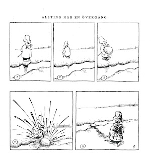
Early Comics Swipe: A. Sorel -> Jacobsson

An early French comic (1888) might have served as an inspiration for a later Adamson gag. The illustration is from a publication in a Flemish illustrated weekly (De Vlaamsche Patriot, 6 September 1891), but as Antoine Sausverd has found out, it was earlier published in a French magazine (La Caricature, in 1888). In that French publication A. Sorel was given as author. It remains a mystery why the Flemish weekly presents us with  a different name. Anyhow, this silent comic might have inspired the Swedish artist Oscar Jacobsson for the Adamson gag, originally published in a Swedish weekly, Söndags-Nisse, 4 February 1923.

Both artists succeed in telling the joke by pure visual means, but Sorel's choice to work with silhouettes for his characters is actually not very efficient in showing the impact of splashing afterwards, contrary to Jacobsson: notwithstanding his dirty face, Adamson's facial expression is clearly visible and funny.