Wednesday, March 27, 2024

Early Comics Swipe: A. Sorel -> Jacobsson

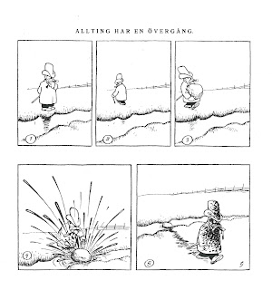
An early French comic (1888) might have served as an inspiration for a later Adamson gag. The illustration is from a publication in a Flemish illustrated weekly (De Vlaamsche Patriot, 6 September 1891), but as Antoine Sausverd has found out, it was earlier published in a French magazine (La Caricature, in 1888). In that French publication A. Sorel was given as author. It remains a mystery why the Flemish weekly presents us with  a different name. Anyhow, this silent comic might have inspired the Swedish artist Oscar Jacobsson for the Adamson gag, originally published in a Swedish weekly, Söndags-Nisse, 4 February 1923.

Both artists succeed in telling the joke by pure visual means, but Sorel's choice to work with silhouettes for his characters is actually not very efficient in showing the impact of splashing afterwards, contrary to Jacobsson: notwithstanding his dirty face, Adamson's facial expression is clearly visible and funny.

Saturday, December 26, 2009

Early Japanese comics


Kyoto International Manga Museum (photo P. Lefèvre)

The Kyoto Seika University International Manga Research Center invited me to participate in their conference Comics Worlds and the World of Comics: Scholarship on a Global Scale (December 18-20) of which next year will be published a bilingual anthology (Japanese/English). It was on the whole an interesting dialogue between Japanese scholars (amongst others Fusanosuke Natsume) and their colleagues from abroad (amongst others Thierry Groensteen and Thomas Lamarre). I presented a paper about the necessities of international collaborations for comparative research. The event took place in Japan's first general manga museum Kyoto International Manga Museum, which features not only interesting exhibitions but has also an impressive library and a research center. The museum is run by the Kyoto Seika University, which was moreover the first Japanese university to set up a proper faculty dedicated to manga. Already on a quantative level it seems to be a huge succes with 852 undergraduate students.
Today in the research center of the museum I had a chanche to browse through some early magazines from between 1900 and 1914 (as Nipponchi and Tokyo Puck). From the few copies of Japanese periodicals I could consult I saw quite a variety in publication formats (though always with soft cover), but all sequential works were drawn in a more or less charicatural style with clear contour lines, mostly with one or more additional color(s). All the characters and locations looked Japanese. On the one hand one can see an important role of politics (as the war with Russia), but on the other hand there is also a lot of purely funny material (as mischief gag comics). I didn't see any translations or reprints of European or American comics - though various magazines clearly refer through their title to 'Punch' or 'Puck'.


Wednesday, December 23, 2009

New publications

Two new publications about my continuing research on early comics were recently released.

One is in English and focuses on panel arrangements and page layouts of early comics published in Belgium in the five decades before the start of Tintin in 1929. It investigates the degree of standardisation in this pivotal period, in which the old system of graphic narratives with captions evolved to comics with balloons. The years between 1880 and 1929 boasted a variety of publication formats (broadsheets, illustrated magazines for adults and for children, comic strips, artists’ books), within which one can see both similar and different conventions at work.

- Lefèvre, Pascal, 'The Conquest of Space. Evolution of panel arrangements and page lay outs in early comics’ in European Comic Art, in European Comic Art, Vol. 2, N°2, 2009, p.227-252 .

The other article is in Dutch and gives an overview of the publication formats of sequential graphics in Belgium before the 1930s.

- Lefèvre, Pascal, 'Panorama van het vroege beeldverhaal in België (1870-1929)' in Sint-Lukas Galerie Brussel, p. 12-17.

Saturday, August 29, 2009

Close up on Busch

The Félicien Rops museum in Namur (Belgium) held this summer an interesting exhibition on Wilhelm Busch in collaboration with the Wilhelm Busch Museum of Hannover. Busch (1832-1908) is widely known as one of the crucial comics artists of the nineteenth century, but as the exhibition showed he painted also extensively (about 1,000 paintings). The artist is of course more known for his humoristic stories such as Max und Moritz. The exhibition showed some original drawings, which Busch executed on a very small format. Nevertheless this small format, every scene is rendered in striking sketchy, loose lines but they do the trick: the pencil drawings are far more curvy and dynamic than the woodcut versions of the broadsheets. The printed version respects largely the original composition, but alters the drawing by using unbroken contour lines, by leaving some elements out (such as the thick hatching on the left) and adding various elements (eg the hatching on the belly of the man). The flat coloring helps in defining various parts or elements that Busch left undefined in his original pencil strokes (for instance the border between the shirt and the trousers of the man).


on the left original pencil drawing by Wilhelm Busch (1870)
on the right printed (wood cut) version of Münchener Bilderbogen (1870)


In the exhibition and the catalogue (only available in French
Wilhelm Busch, de la caricature à la DB) the fact is stressed that Wilhelm Busch was influenced by the new photographic medium and that he - unlike most of his colleagues - did not solely use long shots, but that he included also close ups in his picture stories. Examples can be found in Die Fliege (1861), Der Schnuller (1863), Max und Moritz (1865). Every time he uses the close up for a clear narrative purpose, namely to make some small but important elements bigger: for instance the crushing of an irritating fly under a foot.
So, Busch used close ups long before cinema (
Grandma's Reading Glass of 1900 is often acclaimed to have used for the first time a close up in a short film narrative). Nevertheless it would still take a long time before the insertion of such close ups became a regular practice in various comics.

Die Fliege (1861)

Der Schnuller (1863)

More information and visuals on a website about
Wilhelm Busch
Hans Joachim
Neyer (ed.), Wilhelm Busch, de la caricature à la DB, Oostkamp: Stichting Kunstboek, 2009.

Tuesday, August 18, 2009

Wanted !

A majority of the comics that were published in Belgium before the birth of Tintin in 1929 came from abroad: often the names of the characters are changed and no references to the artists name or the original publication can be found. Therefore I call out to other specialists if they might recognize some of the following characters I found in the Flemish children magazine De Kindervriend early 20th century (unfortunately not dated).

The two characters called in the Dutch text 'Job & Bob' I've already recognized, i
t are the English Weary Willie and Tired Tim by Tom Brown, but does somebody know where and when this gag was first published ?

Tom Brown's Weary Willie and Tired Tim called Job & Bob
in the Flemish children's magazine De Kindervriend (N° 220)

The next panel features some mischievous children, quite resembling to the Katzenjammer Kids. Steve Holland mailed me and suggested that it are: "The Bunsey Boys which appeared in The Wonder in 1901 and continued in The Jester and Wonder when Wonder changed title (but continued its numbering) in 1902. Apparently, the strip was drawn by Leonard Shields when it appeared in the latter, although it is likely he was not the original artist."

from De Kindervriend (N° 221)

Here's another yet unidentified comic character, probably from the British press.


from De Kindervriend (N° 222)

And who's the author and the original of this elephant called 'Jimmy' in the translation by
De Kindervriend.


An elephant called 'Jimmy' in De Kindervriend (N° 214)

So any help with the identification of these comics would be greatly appreciated.

Wednesday, August 12, 2009

International Research Society for Children's Literature 2009 conference in Frankfurt am Main

I.G.-Farben-Haus by Poelzig (1930)
today G
oethe University in Frankfurt am Main (photo Pascal Lefèvre)

I've just returned from the largest academic conference I ever attended to, the 19th biennial congress of IRSCL (International Research Society for Children's Literature) hosted by the German Intitut für Jugendbuchforschung at the Goethe-Universität Frankfurt am Main. Some 400 delegates came from all around the globe to the modern Westende campus, with the famous building by Hans Poelzig, I.G.-Farben-Haus which was once the home of the production administration of Zyklon B. After the war it served for the American army, but in 2001 the Goethe university renamed the building the Poelzig-Bau. The architect Poelzig (1869-1936) fled in 1936 for the Nazi's to Turkey, where he died. He was not only an architect but also a painter and set designer for the movies (Der Golem, wie er in die Welt kam, 1920)
Anyhow his building is impressive and the campus is quite pleasing. The organisation of the conference was perfect - except for the fact that our half day off was planned on a Monday when almost all the musea were closed. With some plenary lectures (unfortunately Zohar Shavit was too ill to travel, so she sent a videotape) and 15 concurrent sessions during 5 days we had an enormous choice. Furthermore English was not the only conference language, but there were lectures and complete panels in French, German or Spanish, which is in itself a good thing if there's at least a translation available - otherwise one only preaches to the already converted.
Except for keynotes, I attended 19 papers (in four different languages) of the concurrent sessions, so I can't judge the global conference. I chose foremost the comics-related papers, but also talks on early representations of Africa. As always, the level was quite variable: I heard some very interesting presentations, such as Giulia Pezzuolo's talk about extraterrestrials in Italian fantastic literature for children, early 20th century. For her most books aimed to convey the dominant values rather than entertain or develop one's critical mind. Sandra's Beckett's visual exploration of the very different contemporary versions of Little Red Riding Hood was quite entertaining. This famous fairy tale figure can be transposed to virtually any cultural setting: from an African in a leopard-skin to a Japanese in a kimono.
Comics specialists should for certain become more active in these circles of children's literature. Browsing through the program it seems that most academics focus rather on content, translation problems or on cultural, ideological aspects, but for instance very few attention is given to the economical side of children's literature. Most scholars were indeed from education or literary departments. It must be also one of the few fields were women outnumber their males colleagues.
I was in a panel on children's media and (post-)colonialism with excellent colleagues from the Netherlands: Lies Wesseling (on the 'adoption plot' in missionary discourse and children's literature), Sybille Lammes (on post-colonial computer games), Helma van Lierop (on the construction of Africa in Dutch children's literature around 1900) and Astrid Surmatz (on representations of Lappland in two Swedish children's book).
Frankfurt turned out a rather pleasant location with interesting musea such as their Film Museum and the Communication's Museum (which are almost neighbors). This winter the archaeological museum will feature an exhibition on the tapestry of Bayeux in collaboration with the French Centre Guillaume le Conquérant, the National Museum in Kopenhagen and the Viking Ship Museum of Roskilde.


the mischievous Max and Moritz still live on
in the streets of Frankfurt am Main (photo Pascal Lefèvre)


Friday, August 7, 2009

A city symphony from São Paulo

still from site Tampere Short Film Festival 2006

The German Film Museum of Frankfurt screened a rarely shown Brazilian ´city symphony´, namely Rodolpho Rex Lustig´s and Adalberto Kemeny´s São Paulo, Sinfonia da Metrópole (1929, link), because only recently restored by the Fundação Cinemateca Brasileira. The screening was part of a larger program on city symphonies (a.o. also one about Tokyo) curated by a PhD-candidate working on this genre, Chris Dähne.

São Paulo, Sinfonia da Metrópole was made by two Hungarian born directors, but who worked in the German film industry after WOI. In the 1920s they emigrated to Brazil, where they were also responsible for the first sound newsreels A Voz do Brasil.
São Paulo was in that period a booming city, by 1930 about 2,5 immigrants had already entered the city . This film was clearly produced before the economic crisis of 1929, because São Paulo, Sinfonia da Metrópole is showing with much pride how well the economy and the government is doing - though the film does not forget the blue collar workers in poor clothings. São Paulo, Sinfonia da Metrópole represents in a categorical organisation various parts of São Paulo´s public and economic live, it´s almost a patriotic propaganda film claiming the coming of an even better society with a ´a better race´(as one of the intertitles says). Remarkably is the long sequence of the city´s new prison. The text explains that crime results from poverty and ignorance, therefore the authorities try to convert the prisoners into better citizens by instructing them manual labour on the fields (´so that they learn to care for plants´), by obliging them to do physical exercises in large groups, drilling them as marching soldiers, educating them (learning to write), and providing - although not obligatory - catholic faith. While the film suggests that we follow one day in the city, from dawn till dusk, this prison sequence proves that it is a condensed montage of various days of filming - in fact the images of this film were taken over a period of two years. Moreover, though the broad composition of the film is categorical, in some sequences there are also small narrative lines interwoven. In the prison sequence we follow a newly arrived prisoner, number 1945: after a introducing aerial shot of the prison, we see number 1945 his fingerprints been taken, superficially examined by the prison doctor. Afterwards number 1945 will reappear in various parts of the prison sequence. While the prisoners are mostly shown as a group in long shots, the camera and the montage sometimes single out prisoner 1945: we see him at the blackboard in the class scene, praying in the church, receiving family visit etc. So, events may be more staged and less documentary than expected. Though the directors largely work with street scenes and with real people, some scenes are not as natural as one could expect from a documentary. Anyhow the directors do not hide this. At a certain point there´s some kind of flash back, we are supposed to see Brazilian soldiers celebrating the indepence in 1822, but the origin of these images remains unclear: were they staged for this film or shot from a contemporary rememberance show or taken from another ´historical film´? Moreover these European emigrant directors must have seen various films from their continent. Of course there´s the influence of other city symphonies (such as Walter Ruttmann´s Berlin: Die Sinfonie der Großstadt), but there are - however not well motivated - references to abstract films (eg. a turning spiral and animated geometrical shapes), to the kind of shots Soviet directors as Eisenstein made famous (close ups of non identified hands grabbing for money)... The overall rhythm of São Paulo, Sinfonia da Metrópole is rather slow and various sequences are not terribly fascinating. It is for certain a less poetic film than the more famous city symphonies. Sometimes the directors use fancy techniques (as graphic matches, special filters), but seldom in a very consistent way. Their film lacks a coherent stylistic approach.
One could have expected at the end of the film a sequence of the city´s night life (bars, vaudeville etc.), but nothing came. Probably this didn´t fit into the overall idea of celebrating uplifting work for a better society. How bright things may look in this film, history didn´t run exactly in the proclaimed direction, because the economic crisis plunged the city in huge problems and the revolution of 1930 would dethrone São Paulo´s political supremacy.