Friday, April 12, 2024

Two different versions of Wagner's Siegfried (1891)

In the late 19th century illustrated weeklies not only entertained their public with short gags, but they delivered also documentary graphic sequences - mostly about important events like disasters or political struggle. Also cultural events could get such a treatment. It is interesting to see how the same event was rendered in quite different ways.
In 1891, Richard Wagner's opera Siegfried was performed for the first time in Brussels (in De Munt/La Monnaie). A cultural event that the illustrated press of that period paid attention to. I compare two different approaches, each of which recreates four scenes from the opera in a different way. 

One version is, according to the caption, by  François Alexandre Alfred Gérardin (1841-1905) after sketches by Drot and was published in 1891 in the French weekly Le Monde Illustré.

The other version is by the Flemish artist Henri Cassiers (1858-1944) and appeared in 1891 in at least two Belgian illustrated weekly magazines (Illustration Européenne and Le Globe Illustré, the illustration used is from the first magazine).

In terms of content, they choose almost the same scenes: Siegfried and Mine in the cave, Siegfried's fight with the dragon, the meeting with Brunnhilde (Cassiers chooses a moment earlier than Drot and Gérardin). One scene of the four chosen scenes is different: Gérardin opts for the scene with Erda, Cassiers for the fight with the Wanderer. Both scenes are from the third act.
Even more important is the arrangement of the scenes (panels) over the page. If we consider the Western reading pattern (from left to right, from top to bottom) there’s a remarkable difference. Drot and Gérardin place the scenes chronologically, according to their order in the opera. Cassiers, on the other hand, disrupts the chronology: it starts at the top left with the Brunnhilde scene from the third act, next the fight with the dragon from the second act, then the fight between Siegfried and the Wanderer from the third act, and ends at the bottom with a scene from the first act (Siegfried arrives in Mine's cave with the bear). We can only speculate as to why the story was rearranged this way. Perhaps Cassiers thought the idea of an underground rock fits better at the bottom of the page, while he places the scene with Brunnhilde on a higher rock (in the open air) at the very top of the page. In this way, Cassiers repeatedly makes an association between cave and a location below, between rock and a location above. Two different concepts of space (diegetic and composition of the page) are thus associated.
In terms of mise-en-scene, there are some correspondences. For instance, the organization of the dragon scene is partly similar: in each case, a large tree is at the front and fairly prominent in the picture, while the battle itself takes a smaller part of the panel and is placed at the background of scène. Of course, this mise-en-scène is largely dependent on the stage version, but an illustrator has still the freedom to frame the picture as he prefers: Cassiers put the tree a little more to the right, which delivers a better composition of the panel. He shows also much less leaves than this French colleagues. The black and white contrasts of Cassiers direct the eyes both to the tree and the fight scene. The French version has less such eyecatchers.
A big difference is thus the drawing style they use. With Drot and Gérardin it is a fairly clear performance, where everything is immediately recognizable. Whether it takes place in a cave or in the open air, everything remains easily identifiable. Cassiers, on the other hand, opts for atmosphere, mainly through chiaroscuro effects. The black and white contrasts make it all a lot more dramatic than Gérardin's good version. Recognizability is apparently less important with Cassiers, but the characters and locations remain recognizable. All in all, Cassier's version feels more Wagnerian.


Thursday, April 4, 2024

Inspiration: C. Cyl -> Jacobsson

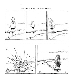
In my contribution to the upcoming conference volume Contemporay Nordic Comics I analyse the inspiration that a Flemish comics artist, Marc Sleen, got from Adamson by Jacobsson. I guessed that Jacobsson himself had also been inspired by other artists. In an earlier blog I already wrote about the similarities with a gag by E. Sorel.  

Here is another example "Pêche à la ligne" by C. Cyl from "Album Noël" of 1900 (the example is from Andy's Early Comics Archive). We see a fisherman who wrongly fears that he has found a dead body in the water. 

 With Jacobsson (Söndags-Nisse 16 Dec 1923) there is no fisherman, but his character Adamson tries to save someone from the water, but he also has to realize that it is only a fashion doll. In both cases, only a piece of the fake "body" is visible, but the artificial piece is submerged at first, only to be revealed in the very last panel. So the basic idea is the same, only a different gag is constructed around it.

Monday, April 1, 2024

Varying the Angles on a Scene by Johann Bahr

Usually the comics of the 19th century offered a quite static viewpoint on scene: the viewer gets a scene from a certain distance, somewhat comparable to the position of a sitter in a theatre. The same distant, static viewpoint the early cinematographers would adopt as well. 

But some comics artists used already a 'moving' viewpoint by using a variation of angles. For instance Töpffer used a kind parallel tracking for a running character. So the displacement of the viewpoint was motivated by the displacement of the character in regards to the background. The different background and the suggestion of a running character informs the viewer to understand that the character is in front of a somewhat different location.
But what if the location stays the same and the characters remain in their place? Also then, there were artists like Johann Bahr (1859-1930) who used a moving viewpoint. My sample comes from a Flemish magazine, De Nieuwe Belgische Illustratie (1891), but originally it was published most likely in a German illustrated magazine.


The comic starts outdoors, we see people looking at a poster, promoting a sensational act “The living speaking human head”. The second panel shows a different location and other characters from the first one. We are at the back of a tent, which seemingly open at the other end. At the forefront of the scene a man with a black heat tries to shoo some kids, in the back of the scene another adult, on a platform, is speaking to a small crowd. In the third panel, the viewpoint has changed a little bit, so that we no longer see what’s in front of the tent, but the attention is directed on the kids, that clearly have returned to the back of the tent, and they are trying to peep into the tent. 

The whole next tier is located inside the tent, we have moved from the exterior to the interior.


The first panel of the second tier shows us at the left the boys peeping through, at the right the public, and in the middle the spectacle: the man who was speaking to the public from the second panel is now standing upright on a platform and is still directed towards the public. Next to him we see a small table, covered with a sheet, on top a human head. The viewer can see what’s hidden from the astonished public: below the small table, there a larger platform, from which, at the back, two naked feet are peeping through. In contrast to the public in front of the spectacle, only the kids, at the back, can see the feet. They are tickling his feet with a twig.
In the fifth panel we still are looking at the act, but from a different viewpoint, namely that of the public. It’s in fact a jump over the 180° degree line, but due to the clear context the viewer is not deranged: the situation remains comprehensible.
No need to repeat the tickling of the feet, we know already what’s going on behind the act. The text explains that the head is making grimaces, most likely the consequence of the tickling. In the sixth panel, the viewpoint is still from the public side, but a little more frontal towards the spectacle.
The last tier offers the twist and the conclusion. 

The viewpoint has shifted a little bit to the right, somewhere between the angle of panel 5 and 6. The man, who was kneeling, can’t hold it any longer and jumps up. The secret of the act is thus revealed publicly. Due to a detail (the path) of his trousers, we recognize the figure from the second panel. The viewpoint of this panel is not easy to locate, because the tent is broken down by the furious public.
The very last panel shows a new location: the two cheats of the act are walking away from the city, on their wheelbarrow the remains of the tent. To make it worse for them, it’s raining. They do not seem happy.
So, though the panels keep the same dimensions and format, there’s a lot of shifting angles in this short gag of 9 panels. There are various changing angles and three different locations: one in the beginning and one at the end. The bulk of the panels present the space of the spectacle, presenting first the exterior before moving to the interior. Inside the tent Bahr cleverly shifts his angles to make the situation visibly clear to the viewer. He does not need the text to explain that the boys are secretly tickling the feet or how the fraud is being committed. He can do it by solely showing!

Pascal Lefèvre

Wednesday, March 27, 2024

Early Comics Swipe: A. Sorel -> Jacobsson

An early French comic (1888) might have served as an inspiration for a later Adamson gag. The illustration is from a publication in a Flemish illustrated weekly (De Vlaamsche Patriot, 6 September 1891), but as Antoine Sausverd has found out, it was earlier published in a French magazine (La Caricature, in 1888). In that French publication A. Sorel was given as author. It remains a mystery why the Flemish weekly presents us with  a different name. Anyhow, this silent comic might have inspired the Swedish artist Oscar Jacobsson for the Adamson gag, originally published in a Swedish weekly, Söndags-Nisse, 4 February 1923.

Both artists succeed in telling the joke by pure visual means, but Sorel's choice to work with silhouettes for his characters is actually not very efficient in showing the impact of splashing afterwards, contrary to Jacobsson: notwithstanding his dirty face, Adamson's facial expression is clearly visible and funny.

Saturday, December 26, 2009

Early Japanese comics


Kyoto International Manga Museum (photo P. Lefèvre)

The Kyoto Seika University International Manga Research Center invited me to participate in their conference Comics Worlds and the World of Comics: Scholarship on a Global Scale (December 18-20) of which next year will be published a bilingual anthology (Japanese/English). It was on the whole an interesting dialogue between Japanese scholars (amongst others Fusanosuke Natsume) and their colleagues from abroad (amongst others Thierry Groensteen and Thomas Lamarre). I presented a paper about the necessities of international collaborations for comparative research. The event took place in Japan's first general manga museum Kyoto International Manga Museum, which features not only interesting exhibitions but has also an impressive library and a research center. The museum is run by the Kyoto Seika University, which was moreover the first Japanese university to set up a proper faculty dedicated to manga. Already on a quantative level it seems to be a huge succes with 852 undergraduate students.
Today in the research center of the museum I had a chanche to browse through some early magazines from between 1900 and 1914 (as Nipponchi and Tokyo Puck). From the few copies of Japanese periodicals I could consult I saw quite a variety in publication formats (though always with soft cover), but all sequential works were drawn in a more or less charicatural style with clear contour lines, mostly with one or more additional color(s). All the characters and locations looked Japanese. On the one hand one can see an important role of politics (as the war with Russia), but on the other hand there is also a lot of purely funny material (as mischief gag comics). I didn't see any translations or reprints of European or American comics - though various magazines clearly refer through their title to 'Punch' or 'Puck'.


Wednesday, December 23, 2009

New publications

Two new publications about my continuing research on early comics were recently released.

One is in English and focuses on panel arrangements and page layouts of early comics published in Belgium in the five decades before the start of Tintin in 1929. It investigates the degree of standardisation in this pivotal period, in which the old system of graphic narratives with captions evolved to comics with balloons. The years between 1880 and 1929 boasted a variety of publication formats (broadsheets, illustrated magazines for adults and for children, comic strips, artists’ books), within which one can see both similar and different conventions at work.

- Lefèvre, Pascal, 'The Conquest of Space. Evolution of panel arrangements and page lay outs in early comics’ in European Comic Art, in European Comic Art, Vol. 2, N°2, 2009, p.227-252 .

The other article is in Dutch and gives an overview of the publication formats of sequential graphics in Belgium before the 1930s.

- Lefèvre, Pascal, 'Panorama van het vroege beeldverhaal in België (1870-1929)' in Sint-Lukas Galerie Brussel, p. 12-17.

Saturday, August 29, 2009

Close up on Busch

The Félicien Rops museum in Namur (Belgium) held this summer an interesting exhibition on Wilhelm Busch in collaboration with the Wilhelm Busch Museum of Hannover. Busch (1832-1908) is widely known as one of the crucial comics artists of the nineteenth century, but as the exhibition showed he painted also extensively (about 1,000 paintings). The artist is of course more known for his humoristic stories such as Max und Moritz. The exhibition showed some original drawings, which Busch executed on a very small format. Nevertheless this small format, every scene is rendered in striking sketchy, loose lines but they do the trick: the pencil drawings are far more curvy and dynamic than the woodcut versions of the broadsheets. The printed version respects largely the original composition, but alters the drawing by using unbroken contour lines, by leaving some elements out (such as the thick hatching on the left) and adding various elements (eg the hatching on the belly of the man). The flat coloring helps in defining various parts or elements that Busch left undefined in his original pencil strokes (for instance the border between the shirt and the trousers of the man).


on the left original pencil drawing by Wilhelm Busch (1870)
on the right printed (wood cut) version of Münchener Bilderbogen (1870)


In the exhibition and the catalogue (only available in French
Wilhelm Busch, de la caricature à la DB) the fact is stressed that Wilhelm Busch was influenced by the new photographic medium and that he - unlike most of his colleagues - did not solely use long shots, but that he included also close ups in his picture stories. Examples can be found in Die Fliege (1861), Der Schnuller (1863), Max und Moritz (1865). Every time he uses the close up for a clear narrative purpose, namely to make some small but important elements bigger: for instance the crushing of an irritating fly under a foot.
So, Busch used close ups long before cinema (
Grandma's Reading Glass of 1900 is often acclaimed to have used for the first time a close up in a short film narrative). Nevertheless it would still take a long time before the insertion of such close ups became a regular practice in various comics.

Die Fliege (1861)

Der Schnuller (1863)

More information and visuals on a website about
Wilhelm Busch
Hans Joachim
Neyer (ed.), Wilhelm Busch, de la caricature à la DB, Oostkamp: Stichting Kunstboek, 2009.